Methods Used:
Behavioral analytics, screen audits, user flows, decision trees, high-fidelity wire framing, prototyping, moderated usability testing, product analytics
Tools Used:
Figma, Mixpanel, UserTesting.com, Jira, Google Workspace, Zendesk
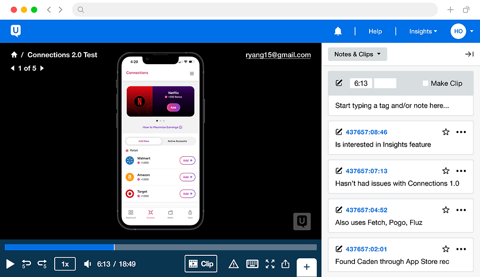
Caden Connections 2.0 Screens
Caden is an app that gives users cash rewards for sharing anonymized data. To share data, users connect intakes—personal accounts, like Amazon, Uber, and Netflix. Within the app, intakes are found on the Connections screens, which I redesigned in the summer of 2024.
User Behavioral Analytics
To start, I analyzed Caden’s connection data—I compared the popularity of each intake to its business impact. To determine business impact, I collaborated with Sales and the Executive Team.

Popularity ≠ Impact
Our business's most critical intakes were not the most popular.
Could they be better promoted?
Connections 1.0 Audit
After analyzing the screen’s metrics, I analyzed its design, finding opportunities for improvement.

🤯 Text Overload
Most pain points had a common theme: excessive text. This can distract users from key content.
No Hierarchy of Intakes
Despite differences in business impact, each intake was given the same visual treatment.
Problem Statement
Based on my findings above, I wrote a problem statement to direct my feature ideation process.
🤔 How Might We...
Guide users towards intakes with the greatest business value,
without compromising the user experience.
Solutions Brainstorm
I explored solutions to guide user intake selections, evaluating the pros and cons of each. Together with the broader Product Team, I determined which solution to move forward with.
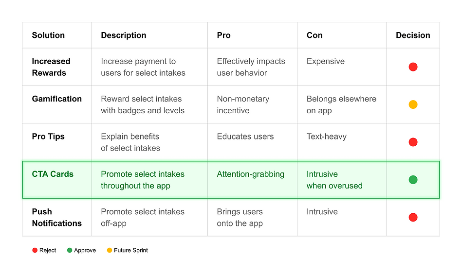
Following the brainstorm, I began the CTA card design process. The first step was choosing where the cards would live on the app.
CTA Card Placement

CTA Selection
I planned to create CTA cards for each intake, which raised the question of when to show each card.
To answer, I developed a decision tree for the Back-End Engineering Team. Below is a small section.
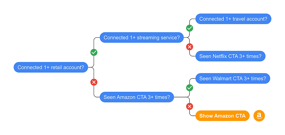
💼
Business-Oriented
Intakes with the highest business impact are
shown first.
👤
Personalized
CTAs are tailored to users, promoting categories they haven't connected yet.
🔀
Flexible
The order of CTA cards
can change at anytime
based on client needs.
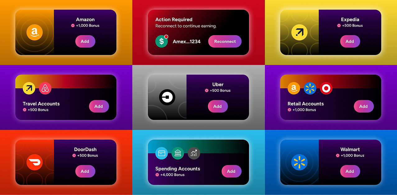
Moving onto visual design, I made CTA cards promoting each intake, category, and Action Required state.
Card Templates
Scalable
The templates can easily be tailored to new intakes
as the app grows and expands its offerings.
🎨 Branded
The cards successfully integrate the color palettes
of both Caden and its intakes.
Responsive Sizing
↕️
Uniform Height
To display in a carousel,
I designed the cards
with uniform height.
↔️
Responsive Width
I scaled the cards for iPhone models ranging from the SE
to the 15 Pro.
✏️
Documentation
I closely documented the card-scaling details, ensuring a smooth handoff to engineers.
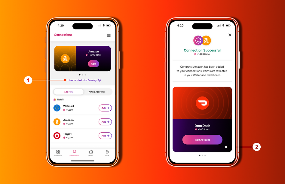
In addition to the CTA cards, I redesigned the layouts of the Connections screen (left), the Connection Success screen (right), and other key interfaces.
High-Fidelity Screens
Uncluttered Design
The original screens were cluttered with explanatory text, which I replaced with links in the redesign.
High Contrast
The dark purple cards stand out against the white background, drawing attention to the CTAs.
Ledger Redesign
Earlier in the project, my screen audit revealed duplicative text on the ledger. Removing the text enabled significant layout improvements, detailed below.

Bigger Logos
Bigger logos enable quick brand recognition and easy scanning.
Added Categories
Organizing the accounts into categories improves user navigation.
Less Scrolling
Each ledger item occupies less vertical space, decreasing scrolling time.
Usability Testing
Before passing the new screens to Front End Engineering, I tested their usability. To assess user comprehension, I asked what connections were, where their connected data would go, and how they would be rewarded. Plus, contributors performed basic tasks, like connecting intakes.
✅ Improved Ease of Use
Test contributors unanimously favored the redesigns, appreciating the reduced clutter from excess text.
🧠 Strong User Comprehension
User comprehension remained strong, despite the decreased explanatory text in the redesigns.
Post-Launch Monitoring
After Connections 2.0 was launched, I kept track of new connections and customer support tickets, confirming the update's success.

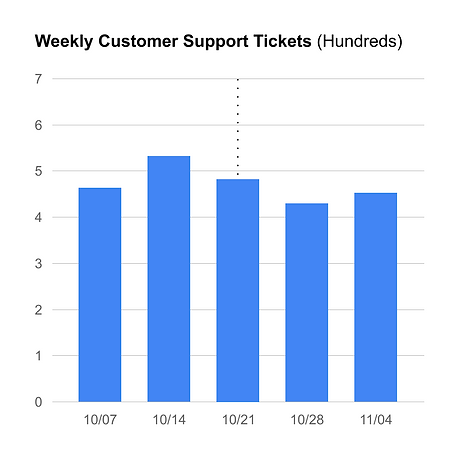
More Connections
There was a 18% increase in connections, discounting the initial spike of launch week.